Visited App
Design Audit
Comprehensive design audit for Visited, a travel tracking mobile app. Focused on improving accessibility, color contrast, user flow optimization, and conversion strategies for their poster monetization feature. Delivered actionable recommendations across UI, UX, and content strategy.
Development duration
5 days
Role
UX/UI Consultant
Tools
Figma, Canva
Client
Mobile App Startup
Product Context:
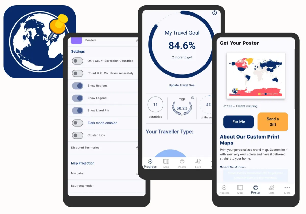
Visited is a travel tracking and planning mobile app with a strong iOS presence (90% of users). Core features include an interactive map view, travel lists, custom poster creation, a personal dashboard, and detailed country information pages.
User Demographics:
The audit was informed by detailed user research data, revealing a specific and valuable user segment:
Target User: Mid-journey travelers actively building their travel story
The Problem:
Despite strong user engagement with core features, the poster monetization feature showed a critical conversion problem. While 23% of users clicked on the Poster screen, less than 0.25% actually customized or purchased a poster, representing a massive 99%+ drop-off in the conversion funnel.
23%
view Poster screen
<0.25%
<0.25% customize/purchase
99%+
drop-off rate
Engagement by Feature:
Screen engagement data revealed clear user priorities and underutilized features:
Monetization Context:
The app had a 0.44% overall conversion rate for in-app purchases. 80% of paying users chose the PRO version, but testing a PRO-only offering caused a drop in conversions, indicating price sensitivity and the importance of the tiered approach.
0.44%
IAP conversion rate
80%
choose PRO version
Design Focus:
Based on this data, the audit prioritized the poster conversion flow as the highest-impact opportunity. The goal was to understand why users were interested enough to explore the feature but not completing purchases, and to provide actionable recommendations for improving the experience.
Project Overview:
Visited is a mobile app that helps travelers track and visualize their journeys. The audit examined the complete user experience, from onboarding to the poster purchase flow, identifying opportunities to enhance usability, accessibility, and conversion rates.
Scope of Work:
- Accessibility audit (WCAG compliance, color contrast, touch targets)
- Color system evaluation and palette redesign
- User flow analysis and optimization recommendations
- Conversion funnel review for poster monetization
- Content strategy and microcopy improvements
Audit Approach:
The audit followed a systematic approach: heuristic evaluation, accessibility testing, competitive analysis, and user flow mapping. Each finding was documented with severity ratings, visual examples, and actionable recommendations prioritized by impact and effort.
Key Achievements:
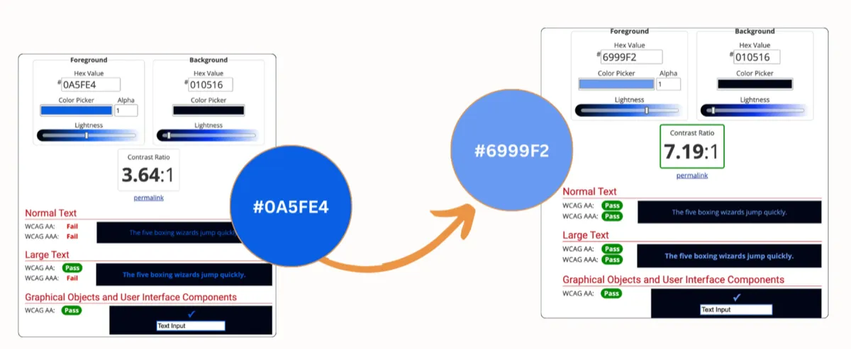
Improved WCAG Contrast Ratios - Enhanced color contrast from 3.64:1 to 7.19:1 for better accessibility compliance
New Themed Color Palettes - Designed 2 cohesive color palettes to strengthen visual hierarchy and brand identity
Optimized Conversion Flow - Streamlined the poster purchase journey with strategic UX improvements
Enhanced Map Customization - Improved the map editing experience with clearer controls and better user guidance
Deliverables:
A comprehensive audit report with annotated screenshots, before/after comparisons, redesigned color palettes, and a prioritized roadmap of UX improvements. The deliverables included both quick wins for immediate implementation and strategic recommendations for long-term product evolution.
View Full Report (PDF)"Exceptional! Went above and beyond to fix the current issues with UI/UX, cannot wait to implement the changes. 5 Stars all the way!"
