Unagi App
Mobile Ordering Experience Design
Unagi is a fictional family-owned restaurant in Tokyo serving traditional Japanese cuisine. For this case study, I designed a mobile app to help a diverse customer base—busy professionals and elderly patrons—order food quickly and independently, without the friction of traditional counter service.
Timeline
May – Oct 2021
Role
Solo UX Designer
Tools
Figma, Paper Prototyping
Deliverables
Research, Personas, Wireframes, Prototypes

The Challenge:
Unagi's customers faced two distinct but related problems:
- Time-strapped workers couldn't afford long waits during limited lunch breaks
- Elderly patrons with mobility limitations struggled to get staff attention in a busy restaurant
Goal:
Design an app that allows customers to browse the menu, view allergen information, and place orders quickly—all from their table or in advance.
My Role:
Solo UX Designer — I led the entire design process from research through high-fidelity prototyping.
- User interviews and empathy mapping
- Persona development and journey mapping
- Paper and digital wireframing
- Low and high-fidelity prototyping (Figma)
- Two rounds of usability testing
- Accessibility considerations and iteration
Research & Discovery:
I conducted interviews with 8 participants about their food ordering habits and created empathy maps to understand their needs. Two primary user groups emerged: working professionals who needed speed and efficiency, and retired individuals who valued independence but faced physical or technological barriers.
Key Pain Points:
Time
Working adults are too busy to spend time waiting for service or meal preparation
Accessibility
Existing food ordering platforms lack assistive technologies and readable fonts
Information
Users need detailed, trustworthy dish information with photos and allergen details
Simplicity
People with limited tech experience need intuitive, straightforward interfaces
Personas:
Misaki
38 years old · Working mother · Part-time publishing employee · Tokyo
"I can't go out for dinner often, so I want it to be a really enjoyable experience."
Misaki is a mother of two toddlers who works part-time while the kids are in nursery. She enjoys dining out with family and friends but is lactose intolerant, making it difficult to find suitable food options.
Goals:
- Maximize quality time with kids
- Find restaurants with clear allergen information
- Order quickly when dining with friends
Frustrations:
- Limited kid-friendly options at restaurants
- Wasting time asking waitstaff about ingredients
- Apps that don't show allergen details
Takao
66 years old · Retired · Widower with 2 adult sons · Takaoka, Toyama
"I want to be able to order by myself without bothering the waitress."
Takao lives with his older son's family but spends a lot of time alone while they're at work and school. He enjoys eating lunch out daily but has arthritis that limits his mobility.
Goals:
- Enjoy eating out independently
- Learn to use new technology
- Maintain dignity and self-sufficiency
Frustrations:
- Difficulty getting staff attention due to mobility issues
- Confusing app interfaces with small text
- Feeling like a burden when asking for help

User Journey Mapping:
I mapped both personas' journeys from downloading the app to receiving their food. This revealed key opportunities for improvement.
| Stage | Task | Opportunity |
|---|---|---|
| Get App | Download & set up account | Step-by-step guide, loyalty rewards |
| Browse Menu | Check dishes, allergens, add to cart | Search & filter, kids' section, large fonts |
| Submit Order | Select table, confirm order | QR code table selection |
| View Confirmation | Get receipt, choose payment | Add 'pay at counter' option |
| Get Food | Receive order, verify correctness | Show estimated prep time |
Ideation & Design:
Paper Wireframes
I sketched multiple variations of each screen to explore different approaches. For the home screen, I prioritized an easy and informative ordering process with clear visual hierarchy.
- Large, prominent CTA button for starting orders
- Horizontal scrolling carousels for dish preview
- Category-based menu organization
- Bottom navigation for easy thumb access
Digital Wireframes
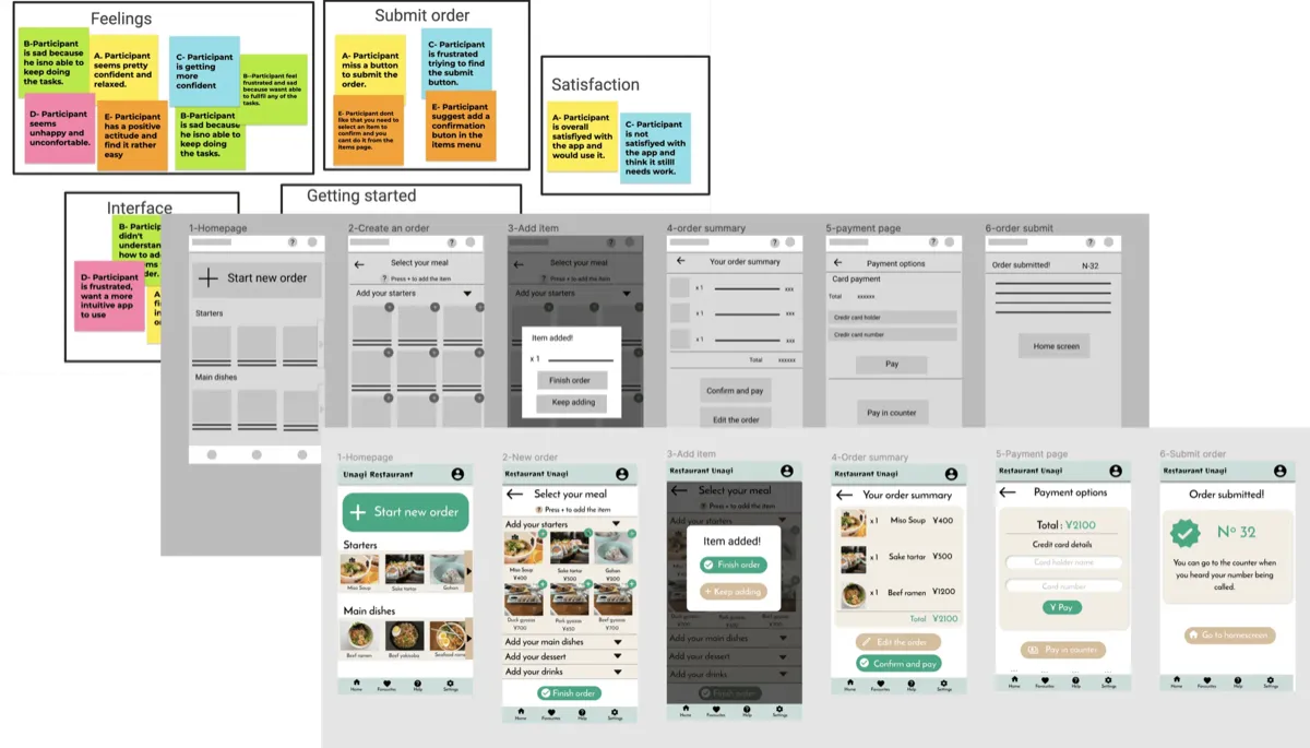
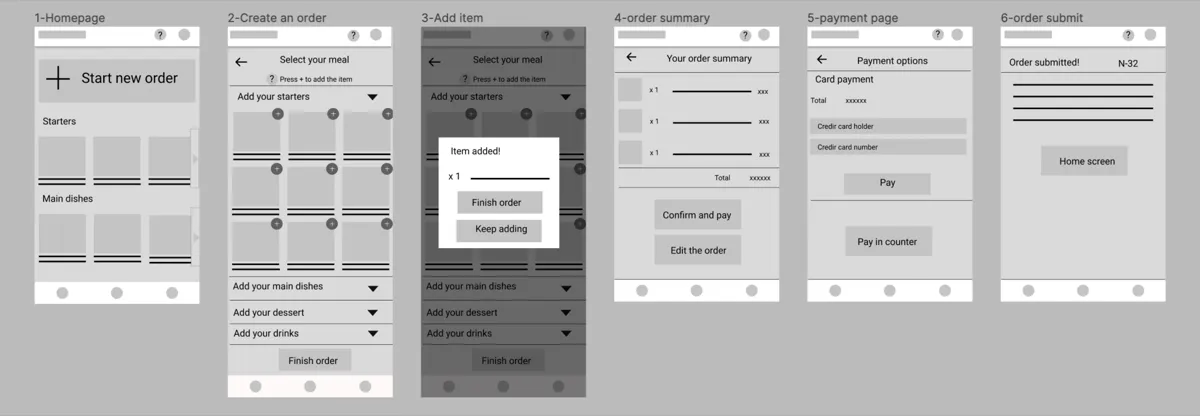
The digital wireframes translated research insights into interface decisions: prominent 'Start New Order' button, horizontal carousel to preview dishes, clear category sections, and bottom navigation bar with icons for accessibility.

Usability Testing:
Round 1 Findings (Low-Fidelity)
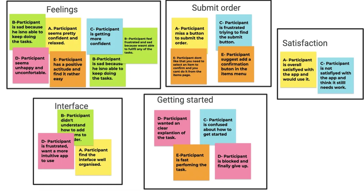
'Submit order' button not clearly visible
HighSolution: Add persistent button at bottom of screen
Users confused by some UI patterns
MediumSolution: Use more conventional design elements
Round 2 Findings (High-Fidelity)
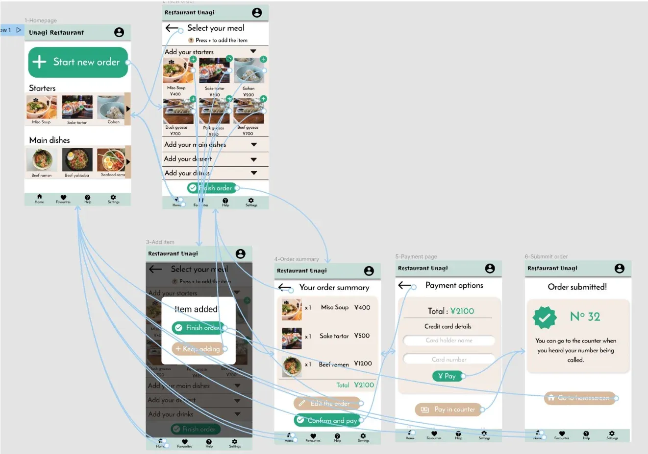
Users wanted more dish details and allergen info
HighSolution: Added allergen tags and expanded dish descriptions
Unclear how to add items to order
MediumSolution: Added helper text: 'Press + to add item'
Users wanted to order faster
MediumSolution: Streamlined flow, reduced steps

Final Design:
Key Screens
1. Home Screen
- Prominent 'Start New Order' CTA
- Carousel preview of popular dishes
- Category-based browsing
2. Menu/Order Screen
- Expandable category accordions
- Allergen information visible
- Persistent 'Finish Order' button
3. Order Summary
- Line items with quantities and prices
- Total clearly displayed
- 'Edit Order' option
4. Payment Options
- Credit card payment
- Pay at counter option

Accessibility:
High Contrast Color Palette
Green (#1B8A6B) on white provides strong contrast. Important buttons use distinct colors.
Icon + Text Navigation
Bottom nav uses both icons and labels, improving usability for all users.
Screen Reader Support
Alt text added to all food images. Semantic structure for assistive technologies.
Adjustable Text (Future)
Identified need for font size options during testing. Recommended for next iteration.
Button Contrast (Future)
Secondary buttons with darker background or black text could improve readability even if current palette meets contrast requirements.
Outcomes & Impact:
The app is really easy and intuitive to use, and there is a lot of information about the dishes. It's perfect for a small but busy restaurant.
— Peer Review Feedback
Key Achievements:
- Created accessible ordering flow for both tech-savvy and elderly users
- Addressed all 4 major pain points identified in research
- Validated design through 2 rounds of usability testing
- Delivered comprehensive design system for developer handoff
Reflections & Next Steps:
What I Learned
This project reinforced the importance of following the complete design process. Every round of research and testing revealed insights that significantly improved the final product. The biggest lesson: never assume you know what users need—always validate.
Next Steps
- Additional usability testing to validate that pain points have been fully addressed
- Expanded user research to identify new feature opportunities
- Accessibility audit with users who rely on assistive technologies
- Developer collaboration for implementation guidance
Full Case Study: