nuxt-dashboard-ui
Open-source Nuxt 3 Library
A Nuxt 3 component library for building dashboard and admin interfaces. Hydration-safe, accessible, fully typed, and zero CSS dependencies. Every component is designed to work flawlessly with SSR, follows WCAG 2.1 AA from the ground up, and uses a design token system with CSS custom properties for full theming control.
Role
Solo Developer
Tools
Nuxt 3, TypeScript, Vitest, Vue Test Utils, CSS Custom Properties
npm
Open-source library
Live Demo
Click here to see it live
12
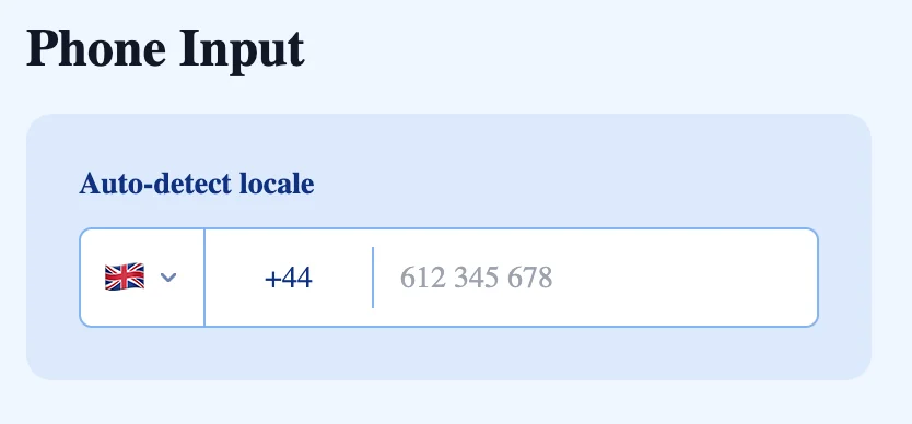
Components
6
Composables
382
Tests
WCAG
2.1 AA
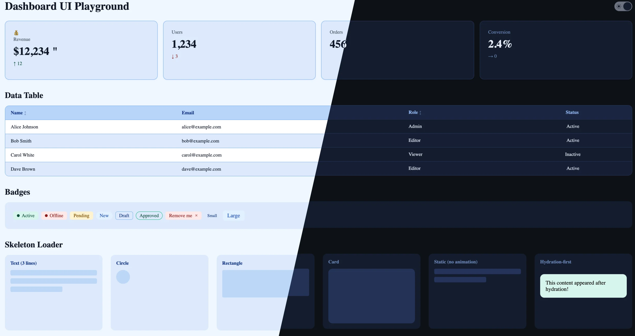
Hydration-First:
Every component works flawlessly with SSR. useHydrated() composable, Teleport only after hydration, SkeletonLoader hydrate mode, locale detection after mount. Zero hydration mismatches by design.
Accessibility-First:
Semantic HTML, full ARIA support, complete keyboard navigation, focus trapping, focus-visible outlines, screen reader text, 44px touch targets, reduced motion support, and WCAG AA contrast ratios verified for all colour combinations.
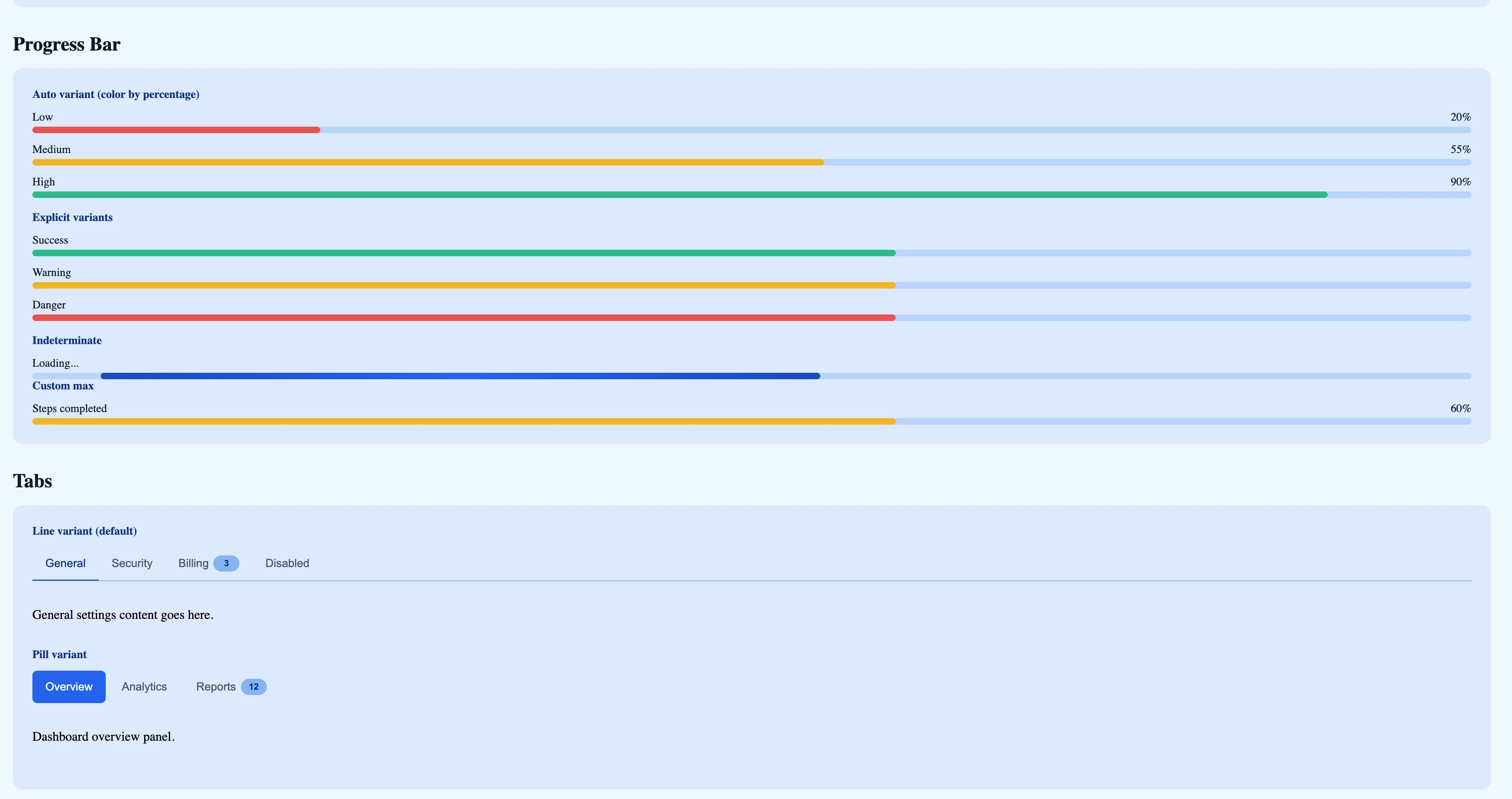
Components:
Composables:
Design Token System:
Component-level CSS variables with global token fallbacks. Works standalone, responds to a global theme, and supports per-instance overrides. Dark mode via .dark class with a 4-level surface hierarchy.